Messages Screen
The MessagesScreen component is the second screen component in the SDK, out of the box it provides you with the following features:
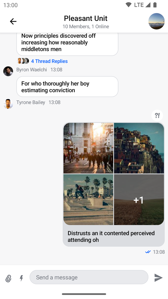
- Header: Displays a back button, the name of the channel or thread and a channel avatar.
- Messages: Shows a paginated list of messages if the data is available, otherwise displays the correct empty or loading state. Sets up action handlers and displays a button for quick scroll to bottom action.
- Message composer: Handles message input, attachments and message actions like editing, replying and more.
- Attachment picker: Allows the user to select images, files and media capture.
- Message options: Shown when the user selects the message by long tapping. Allows the user to react to messages and perform different actions such as deleting, editing, replying, starting a thread and more.
- Reactions menu: Shown when the user taps on a reaction to a message. Displays all of the reactions left on the message along with the option to add or change yours.
Usage
The benefit of a screen component solution is easy integration. All you need to do to integrate MessagesScreen in your app is to call it within setContent() in your Activity or Fragment and pass in the MessagesViewModelFactory with your channelId:
override fun onCreate(savedInstanceState: Bundle?) {
    super.onCreate(savedInstanceState)
    // Load the ID of the channel you've opened
    val channelId = "messaging:123"

    setContent {
        ChatTheme {
            MessagesScreen(
                viewModelFactory = MessagesViewModelFactory(
                    context = this,
                    channelId = channelId
                )
            )
        }
    }
}
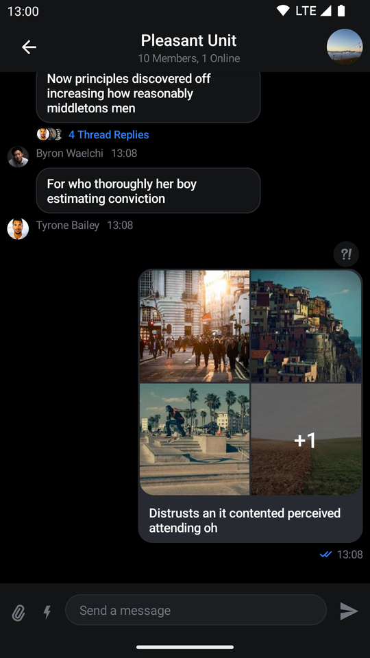
This small snippet of code will render the UI shown below:
| Light | Dark |
|---|---|
 |  |
Next, learn more about handling screen actions.
Handling Actions
The MessagesScreen component exposes two actions, as per the signature:
@Composable
fun MessagesScreen(
    ..., // State
    onBackPressed: () -> Unit = {},
    onHeaderTitleClick: (channel: Channel) -> Unit = {},
    onChannelAvatarClick: () -> Unit = {},
)
onBackPressed: Called when the user taps on the header back button.onHeaderTitleClick: Called when the user taps on the header title. Useful for showing the channel information.onChannelAvatarClick: Called when the user taps on the channel avatar. Can also be used to show more channel information.
Here's an example of setting up custom behavior:
MessagesScreen(
    ..., // State
    onBackPressed = { finish() }, // Navigation handler
    onHeaderTitleClick = { channel ->
        // Show channel info
    },
    onChannelAvatarClick = {}
)
Customization
Given that MessagesScreen is a screen level solution, it offers limited customization. Currently, the options offered in the signature are the following:
@Composable
fun MessagesScreen(
    viewModelFactory: MessagesViewModelFactory,
    showHeader: Boolean = true,
    ... // action handlers and state
)
viewModelFactory: The factory that you build yourself. This lets you control not just the way theViewModels are built, but also their lifecycle, as you can share them between components. This requires of you to provide achannelIdin order to power the screen and show data, but it also allows you to customize the behavior of the screen through various parameters.showHeader: Controls whether the messages header is shown or not.
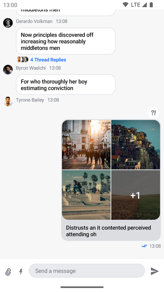
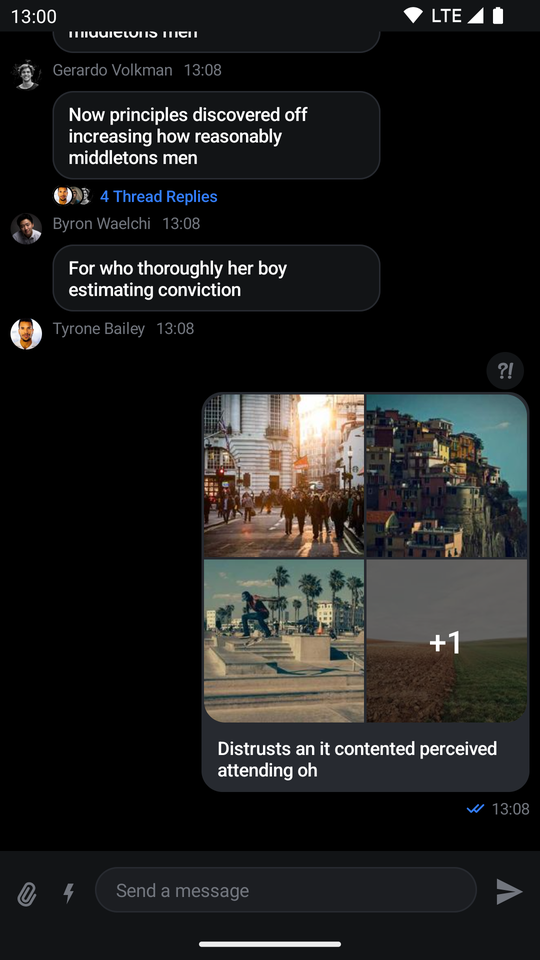
If you set showHeader to false you'll get the following UI:
| Light | Dark |
|---|---|
 |  |
As you can see, the header is removed from the screen, rendering only the list and the composer.
Overriding the ViewModels
In case you want to control the logic when using the MessagesScreen, you can do so by providing a MessagesViewModelFactory that you use to build the respective ViewModels yourself.
Here's an example:
class MessagesActivity : ComponentActivity() {

    // 1
    private val factory by lazy {
        MessagesViewModelFactory(
            context = this,
            channelId = channelId,
            // Customization options
        )
    }

    // 2
    private val listViewModel by viewModels<MessageListViewModel>(factoryProducer = { factory })

    private val attachmentsPickerViewModel by viewModels<AttachmentsPickerViewModel>(factoryProducer = { factory })
    private val composerViewModel by viewModels<MessageComposerViewModel>(factoryProducer = { factory })

    override fun onCreate(savedInstanceState: Bundle?) {
        super.onCreate(savedInstanceState)

        setContent {
            ChatTheme {
                MessagesScreen(
                    // 3
                    viewModelFactory = factory,
                    onBackPressed = { finish() },
                )
            }
        }
    }
}
There are a few steps here that allow you to override and control the ViewModels:
- You create the
MessagesViewModelFactoryyourself, which lets you describe the data and configuration used to build theViewModels. - You lazily create an instance of the required
ViewModels. This means that you'll either build theViewModelfirst and then pass it to the Compose component, or your Compose component will create theViewModeland you'll get access to it here. - You pass in the factory to the
MessagesScreen, which allows this connection to happen.
The ViewModels should be the same and you should easily be able to react to things like item clicks, changes in the state and more.
Even though MessagesScreen offers limited customization, you can still achieve a unique look and feel by modifying ChatTheme parameters.
For more information on how to do so read our Customizing Components page.